Creating Shaders #1: Image Reveal with Brush Stroke
Oct 17 2025
As a big fan of Avatar: The Last Airbender, I was excited to watch the new reveal trailer for their fighting game. One thing that caught my eye in the trailer, was the brushstroke reveal effect they used - especially for the character reveals (seen at this time stamp and in the video below).
I wanted to see if I could recreate that effect on the web, and I knew this would lead me into some new territories - taking a stab at shaders! Using the knowledge I had from Bruno Simon's excellent Three.js Journey course and following along with this Codrops tutorial - How to Code a Shader Based Reveal Effect with React Three Fiber & GLSL - I built a custom shader to achieve a similar reveal and am quite happy with the results.
While I wont step through the fragment shader line by line (you can see the entire code in my repo), here are some sections where I had my ah ha moments:
// applyMaskToSection(float yStart, float yEnd, float uProgress, float minProgress, float maxProgress, bool goFromLeft)float topThirdAlpha = applyMaskToSection(0.666, 1.0, uProgress, 0.0, 0.33, false);float middleThirdAlpha = applyMaskToSection(0.333, 0.85, uProgress, 0.33, 0.66, true);float bottomThirdAlpha = applyMaskToSection(0.0, 0.6, uProgress, 0.66, 1.0, false);Above, I needed to apply the mask to the image in three parts to try to match the effect from the video. At first, I divided them evenly (33% each) but quickly realized it wouldn’t work. The mask image I was using had white space around the brush stroke, which left visible gaps between sections that weren’t being revealed. By overlapping the three sections, I was able to fully reveal the image and achieve the smooth, continuous effect I was aiming for.
// applyMaskToSection(float yStart, float yEnd, float uProgress, float minProgress, float maxProgress, bool goFromLeft)float progress = clamp((uProgress - minProgress) / (maxProgress - minProgress), 0.0, 1.0);float wipeEdge = progress; float wipeProgress = smoothstep(wipeEdge - wipeWidth, wipeEdge + wipeWidth, vUv.x);Here, I am checking how far we have progressed in the current section of the image we are applying the effect to. uProgress is a uniform value, from 0-1, that is sent to the shader to animate the reveal. Then, the image's uv is animated based on the progress and the width of the reveal.
In the video above, you can see the original reveal animation from the trailer (top) compared to the webgl shader.
After creating this shader, I got the fun idea to use scroll progress as the input value for uProgress. From there, I got a bit carried away and ended up making my own version of an announcement website for the game, using scroll animations and my shader.
You can check out my site here. This was purely for fun and to learn a bit more about shaders, the official site for the game can be found here.
The code for the site I made can be found here and if you are just looking for the shader code it is here
Recreating Motion #3: Image in Text Reveal
Sept 5 2025
This time, I set out to recreate an animation I saw on a subway advertisement from Fotografiska:
As always, you can scroll down to see it in action, or keep reading for a quick breakdown of my approach.
This time I decided to animate with CSS animations and Javascript. With JS, I am using a requestAnimationFrame to loop through the images repeatedly. Then using CSS, I am animating the image container's width to open and close the container.
To take it one step further, in the code demo linked below I added a few customizable props. You can change the text, decide where in the text the images should appear, and pass in any array of images you want to showcase. This makes it easy to adapt the animation for different projects and use cases.
Also, in the code repo you can see a bonus second demo showing off a scroll into view version using Framer Motion to mock the example as seen on Netflix's career page here.
PHOTOS
N ICE
ICE

BRING
E YES
YES

See the code here
Recreating Motion #2: Mask Reveal
Aug 15 2025
This time, I set out to recreate an animation from Motion Highlights #11:
Animation by satto.studio
As always, you can scroll down to see it in action, or keep reading for a quick breakdown of my approach.
Using Framer Motion, I animated both the CSS clip-path and rotate properties on a div that wraps around the image. From there, I just needed to apply the same rotation to the child image, but in the reverse direction to keep the image visually "still". It's a straightforward setup, but a visually appealing result! Here is the final output:


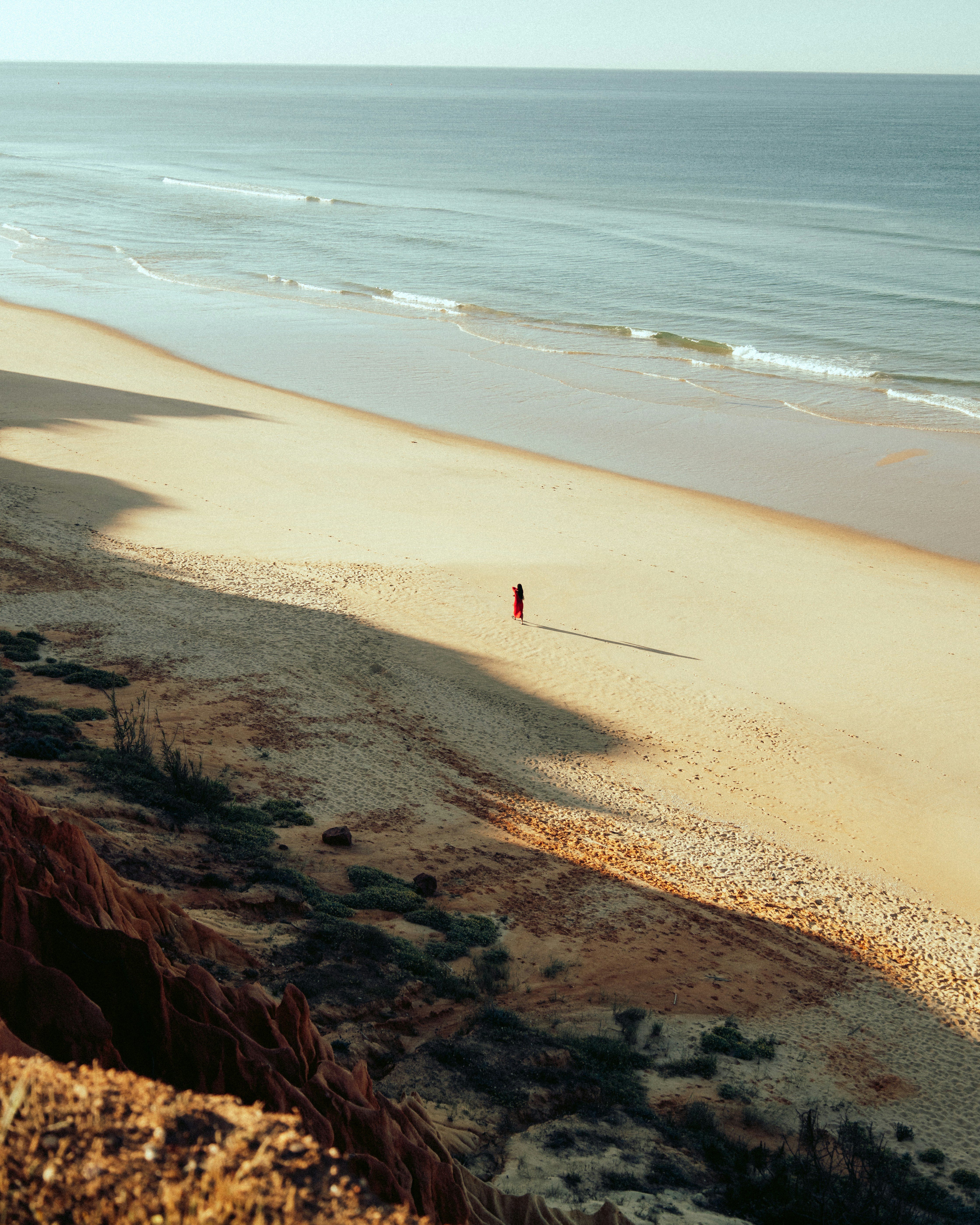
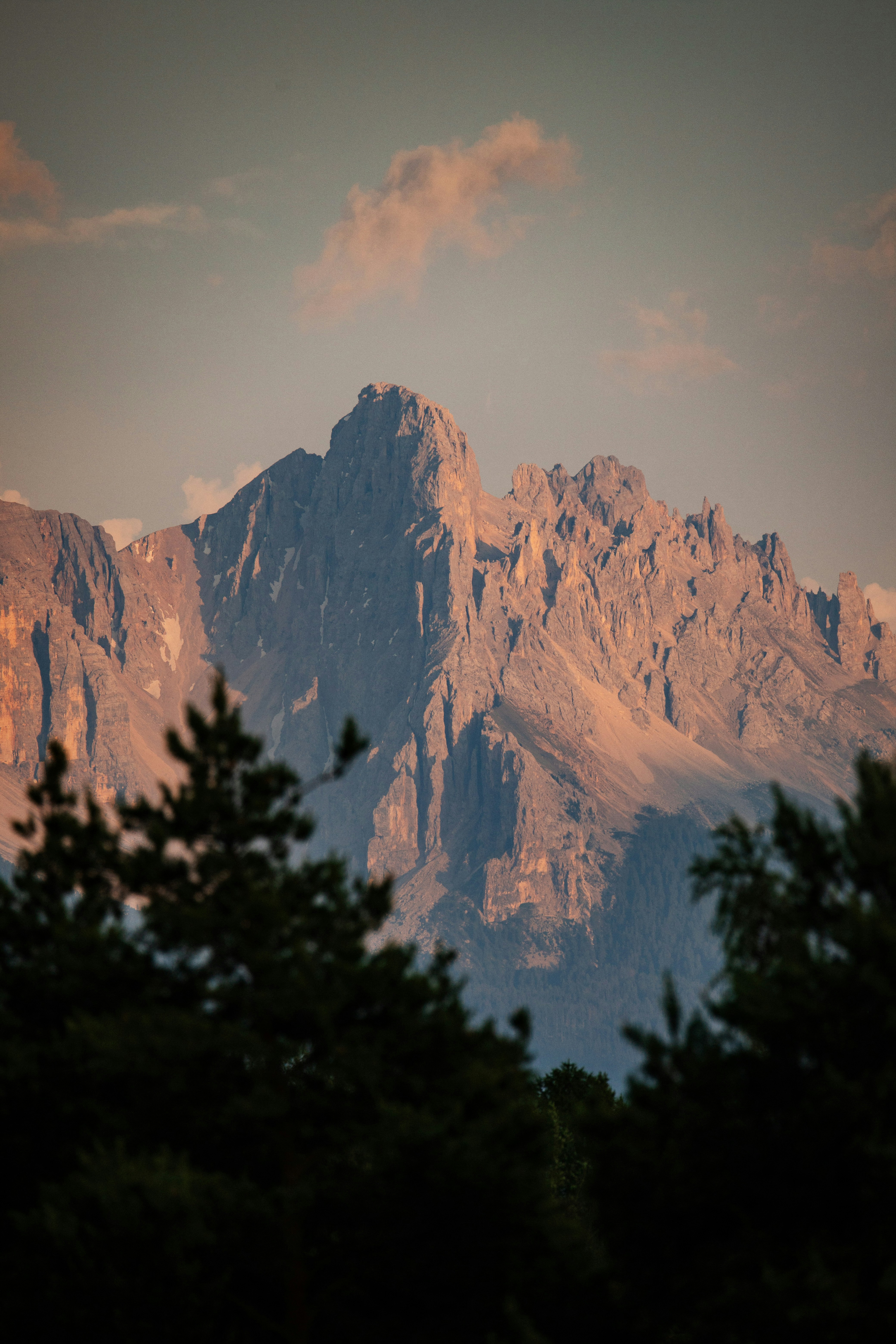


Photo by Rodrigo Silva on Unsplash
Photo by Evgeni Tcherkasski on Unsplash
Photo by Marko Brečić on Unsplash
Photo by Shutter Speed on Unsplash
Photo by Venti Views on Unsplash
See the code here
Recreating Motion: Text Animation
Aug 5 2025
Recently, I stumbled upon Codrops' Motion Highlights #10 article and got stuck staring at this animation:
Text Animation by Antonin Waterkeyn
I thought it would be interesting to try recreating it on the web. You can scroll down to see it in action or read more about my approach
Using Framer Motion, I quickly got the basic motion working, moving the letters and background stripes left to right. But there were two tricky things about recreating this animation:
Challenge 1: How the backgrounds of the letters separate and combine with each other
One of the main factors that drew me into wanting to recreate this animation was how the letters visually merge into words and then separate again. As a way of recreating this style, I remembered an old article on css-tricks that I bookmarked a while ago about using SVGs to create The Gooey Effect. This approach successfully recreated the effect, and watching the letters separate and merge felt like a big win!
Challenge 2: Layering the letters and background stripes
In the video the gray backgrounds of the letters sit on top of the yellow stripes, but blend in with the gray stripes.
Normally, this is a job for z-index, but the issue there is the letter and its gray background needed to live in the same component yet have different stacking contexts. That's a no-go with just CSS.
In this case, I decided to use a React portal to have a place for the letters to render on top of the stripes and follow their gray background elements one-to-one in motion. This way it looks like they are one component, even though the letter itself is rendered in the portal. I think this is a fun solution - but would love to hear if anyone else has ideas on how to solve this in a different way and make it even cleaner!
To expand upon the idea, I added an input box for you to add your own lines in! For this, I just recalculate the height and width in order to fit the length of the words. While this is only a little experiment I did, I had a lot of fun grabbing a beautiful, random example from the internet and seeing how I would go about recreating it! Try it out below:
See the code here